
Introduction
In today’s data-driven world, raw numbers alone don’t tell a compelling story. That’s where data visualization comes in. It transforms complex datasets into visual formats like charts, graphs, and dashboards—making it easier to understand patterns, trends, and insights at a glance.
Whether you’re a student, business analyst, or developer, learning data visualization is a foundational skill in fields like analytics, AI, and decision-making.
What is Data Visualization?
Data visualization is the graphical representation of information and data using visual elements such as:
- Charts
- Graphs
- Maps
- Dashboards
The goal is simple: make data easy to understand and actionable.
Why is Data Visualization Important?
- Quick Understanding – Humans process visuals faster than text
- Better Decision-Making – Identify trends and patterns easily
- Storytelling – Turn data into meaningful narratives
- Error Detection – Spot outliers and anomalies quickly
Types of Data Visualization
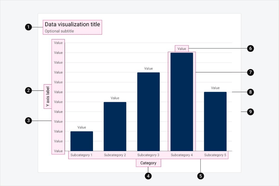
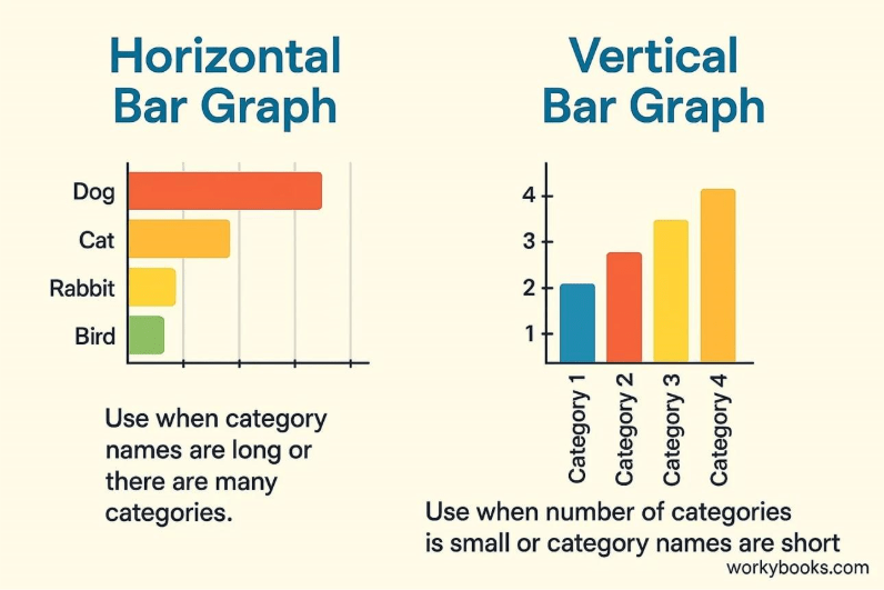
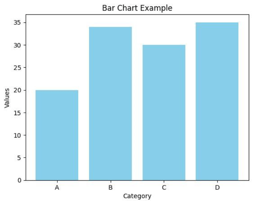
1. Bar Charts
6
Used to compare quantities across categories.
Example: Comparing sales of different products.
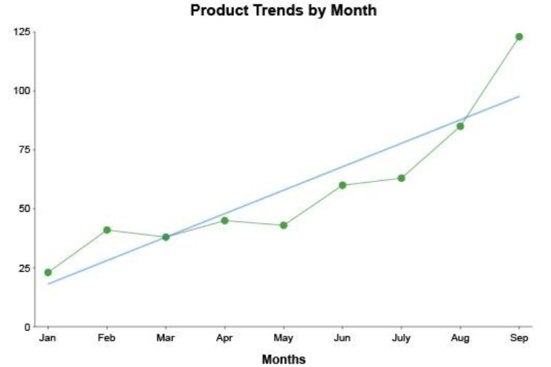
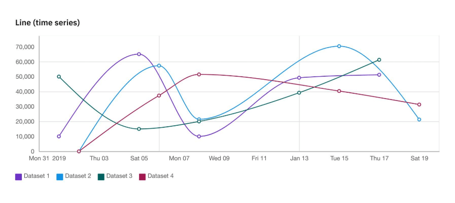
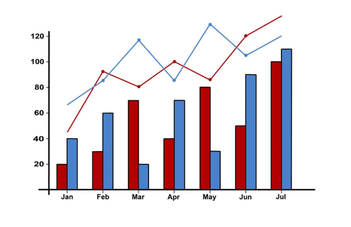
2. Line Charts
6
Best for showing trends over time.
Example: Website traffic growth over months.
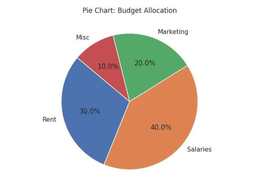
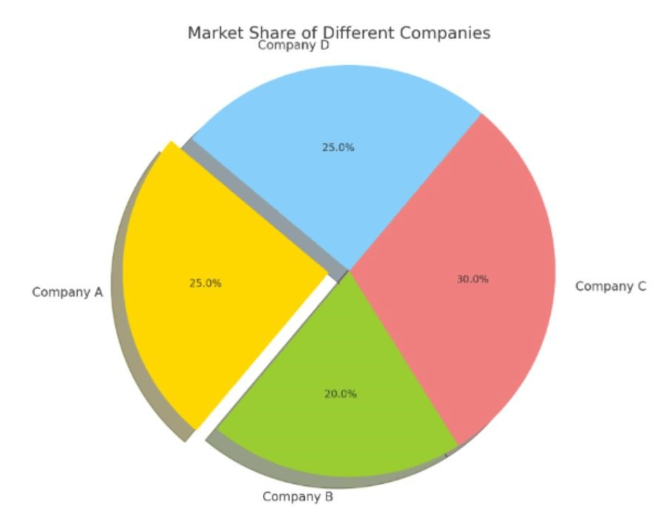
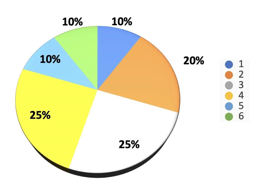
3. Pie Charts
7
Shows proportions of a whole.
Example: Market share distribution.
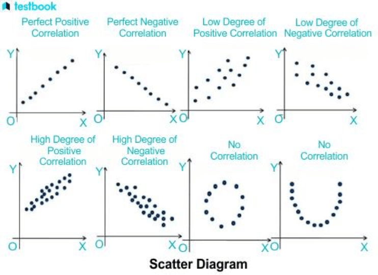
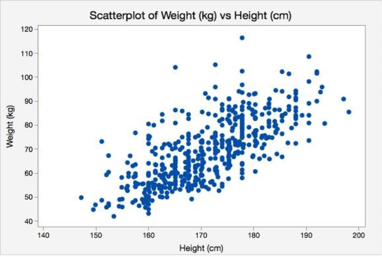
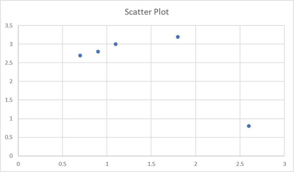
4. Scatter Plots
6
Displays relationships between variables.
Example: Height vs weight correlation.
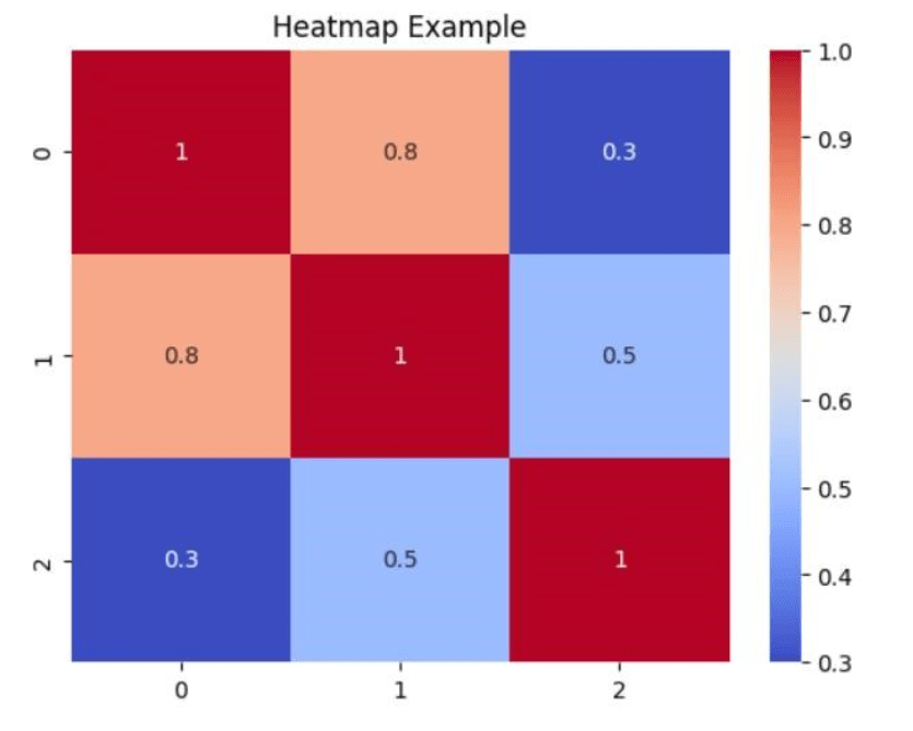
. Heatmaps
6
Uses color intensity to show data density or variation.
Example: Website click tracking.
Popular Data Visualization Tools
- Microsoft Excel – Beginner-friendly and widely used
- Tableau – Powerful for interactive dashboards
- Power BI – Great for business intelligence
- Python (Matplotlib, Seaborn) – Flexible for developers
- Google Data Studio – Free and cloud-based
Best Practices for Effective Visualization
- Keep it Simple – Avoid clutter and unnecessary elements
- Choose the Right Chart – Match chart type to data
- Use Colors Wisely – Highlight key insights, avoid overuse
- Label Clearly – Add titles, legends, and axis labels
- Focus on Storytelling – What insight are you trying to convey?
Common Mistakes to Avoid
- Using the wrong chart type
- Overloading visuals with too much data
- Misleading scales or axes
- Ignoring audience understanding
Getting Started
- Start with simple tools like Excel
- Practice with real datasets (sales, student scores, etc.)
- Explore advanced tools like Tableau or Power BI
- Learn basic coding for visualization using Python
Conclusion
Data visualization is more than just charts—it’s about communicating insights effectively. By mastering the basics, you can transform raw data into powerful stories that drive smarter decisions.